Designing Activewear for Everyday Wear — The Small Choices That Take a Piece From Gym to Street
Read the reviews under almost any activewear brand and a pattern shows up fast. “Wore these to yoga once — now I live in them.” “Bought them for the gym, ended up wearing them to work.” “So comfortable I forget they’re leggings.” The customer bought a training piece and quietly turned it into daily clothing. On a lot of activewear lines, most of the wearing happens nowhere near a workout: the school run, the café, the flight, the errands, the evening on the sofa.
That isn’t a reason to design worse gym gear. It’s a reason to design one piece that survives both. And the good news for a small brand is that day-to-night versatility is mostly a handful of quiet choices — finish, silhouette, colour, waistband, branding — not an extra fabric or a bigger budget. Here’s what actually moves a piece from “gym only” to “wear it all day,” and why it’s cheapest to build in from the first collection.
Hand-feel and finish: matte reads as clothes, shiny reads as gym
The single loudest day-to-night signal is finish. A high-sheen, almost “wet-look” face reads instantly as performance gear — striking under studio lights, out of place at a dinner table. A matte or lightly peached face reads as clothing. Same fibre content, completely different message. You can get matte from the yarn, from the knit structure, or from a brushed/peached finish, and it tends to hide light and lint better in everyday settings too.
Weight is the other half, and it’s where brands both over- and under-spend. Too light and the fabric turns sheer under daylight and office lighting — a studio-only garment becomes an all-day problem. Too heavy and it wears like outerwear. For a piece meant to live all day, a reliably opaque mid weight usually does more than the featherlight “barely there” fabric that only behaves in a dim room; the fabric weight guide sets out sensible GSM by category. Honest note: you rarely need a second, separate “lifestyle” fabric. One well-chosen matte, opaque, mid-weight knit does double duty, and paying for a dedicated everyday fabric on top of your training fabric is usually money the customer never feels.
Silhouette and waistband: the lines people read first
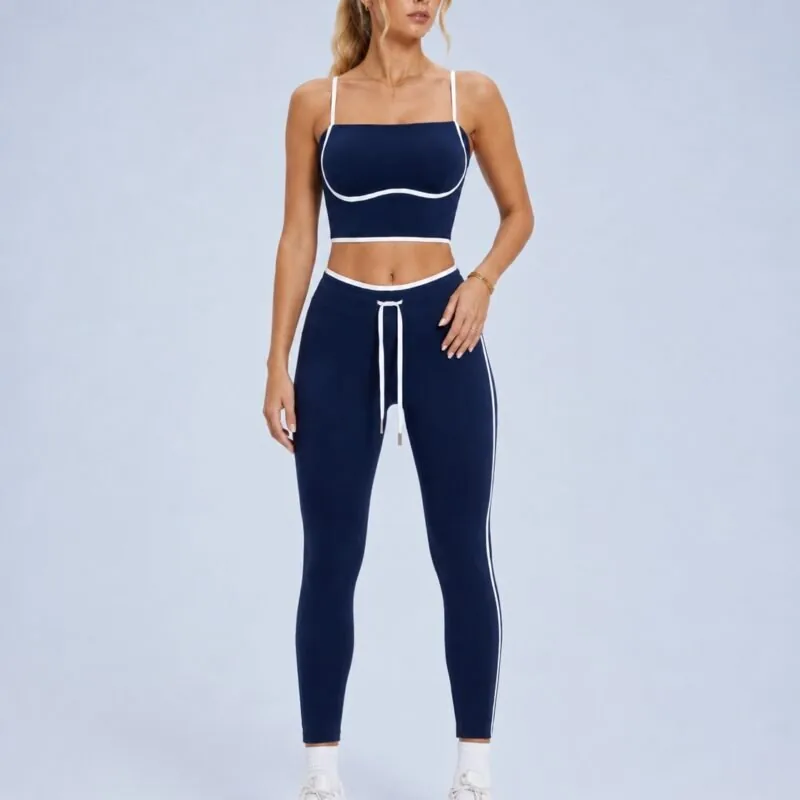
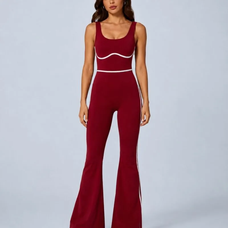
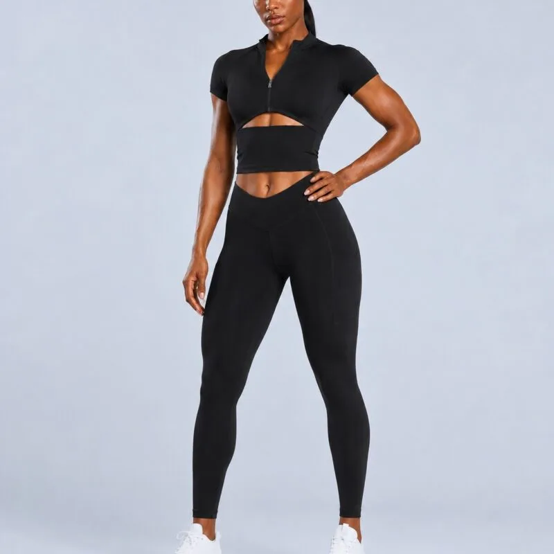
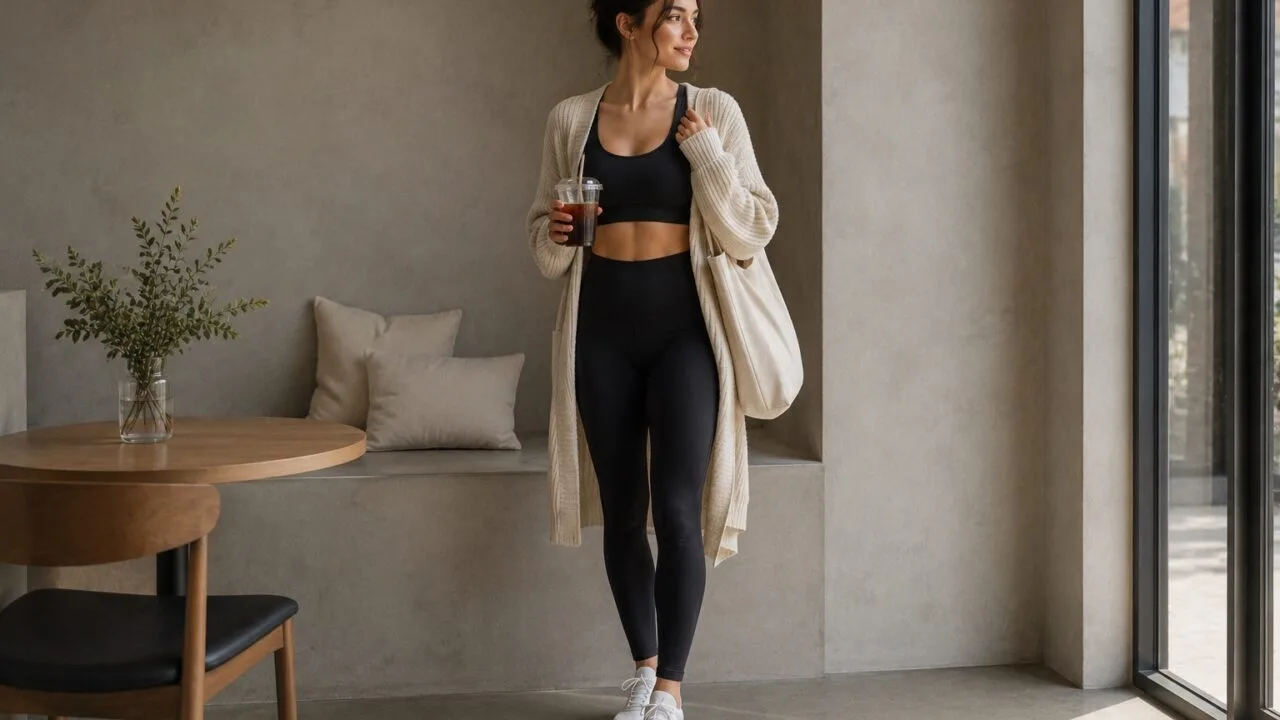
Clean lines read as clothing; busy contrast panels read as sportswear. A simple side, a tonal seam, a mid-rise that sits comfortably under a tucked or untucked shirt — small things that let a legging pass as trousers rather than announce itself as kit. The waistband quietly decides a lot of it: a wide, firm compression band is right for lifting and wrong for eight hours at a desk, where it prints a ridge under a shirt and digs when you sit. A smooth, mid-height band all but disappears under clothing.
Construction method shows here. On seamless knitting the piece comes off the machine as a tube with no side seams — a clean, uninterrupted matte line that reads closer to ready-to-wear than to gym kit. Large-cylinder machines (17–21″) carry that same clean line up into plus sizes, around 2XL/3XL, so the everyday look isn’t reserved for straight sizes. Where you want structured tailoring, real pockets, or a sharper cut, cut-and-sew is the right tool. Neither method is “the versatile one” — they’re two routes to a clean line, and the choice follows the look you’re after.
Colourways: build a wardrobe, not a rainbow
A piece is more versatile when it plays well with the rest of a wardrobe — including the rest of your own line. That argues for a tight, coordinated palette: a core of neutrals (black, stone, slate, deep olive) that go with everything, plus one or two accent colours per drop, rather than twelve one-off brights. Muted and earth tones read more day-to-night than pool-bright saturation, and a disciplined palette is what lets matching sets and separates actually mix.
Getting neutrals to agree across fabrics and dye lots is harder than it looks — a black bra and black legging in two different fabrics can read as two different blacks in daylight — which is exactly what Pantone colour matching exists to control. Where not to spend: a sprawling colour range. Every extra colour multiplies minimums, inventory and matching risk, and rarely buys versatility a coordinated core hasn’t already given you.
Branding you can wear to dinner
Subtle branding widens where a piece is allowed to go. A large chest or thigh logo effectively caps a garment at “gym and errands”; a small tonal mark — a heat transfer the same colour as the fabric, a woven waistband tab, a debossed detail — lets it pass as plain clothing while the customer who loves the brand still recognises it. The five logo methods compare how each looks and lasts; for day-to-night, tonal and small usually beats big and bright. This is a genuine place to spend less, not more — restraint tends to read as expensive, and a quiet mark gets worn far more often than a loud one.
Plan versatility from the first collection
Versatility is easiest and cheapest to build in at the start, while your fabric family, palette and fits are all still open. If your first drop shares one fabric family and one coordinated palette, every piece multiplies with every other — a few styles turn into a lot of outfits, and customers assemble the sets themselves. Bolt versatility on two seasons later and you’re fighting mismatched blacks and orphan colours that never quite belong.
You don’t need a large range to do this. A small, coherent capsule that mixes beats a scattered one that doesn’t. Because stock styles with your own logo often start around 100 sets, and full custom development around 300–500 pieces, you can test a tight, versatile core without committing to a big collection first — the how to start an activewear brand guide walks through sequencing that first drop.
The same legging, two ways
The spec, not the price, is usually what decides whether a piece stays in the gym bag.
| Design choice | Built to train only | Built for day-to-night |
|---|---|---|
| Fabric finish | high sheen, “wet” look | matte / peached hand-feel |
| Weight & opacity | very light, sheer risk in daylight | reliable mid weight, fully opaque |
| Waistband | wide, firm compression | smooth mid-rise that sits under a shirt |
| Seams & panels | contrast athletic seam lines | tonal, minimal seams |
| Logo | large chest or leg print | small tonal mark or woven tab |
| Colour | one bright brand colour | neutral core + one accent |
Neither column is “wrong” — a dedicated training legging should lean left. The point is to choose the column on purpose, not to design the left one and hope it also lives on the right.
The day-to-night test: read a sample like a factory
When a sample lands, don’t only squat-test it. Daily-life-test it:
- Two lights. Photograph it in daylight and in indoor light. If the sheen jumps between them, it reads gym, not street.
- Opacity in real light. Bend and sit under normal room light, not a dark studio — that’s where sheerness shows.
- Style it plainly. Pair it with a non-athletic top. Does it still look like clothes, or unmistakably like leggings?
- Waistband under a shirt. Tucked and untucked — any ridge? Any dig after ten minutes sitting?
- Branding at arm’s length. Step back. Does the logo shout across a room, or stay quiet?
- Lay it next to the line. Put it beside two other pieces. Do the neutrals truly match, and do they coordinate?
FAQ
What actually makes activewear look “everyday” instead of “gym”? Mostly finish and restraint. A matte (not shiny) face, a clean silhouette, a smooth mid-rise waistband, a tight neutral palette and small tonal branding all read as clothing. High sheen, contrast panels, hard compression bands and big logos read as sportswear.
Do I need a separate fabric for lifestyle versus performance? Usually not. One matte, opaque, mid-weight knit does both jobs. A second dedicated “lifestyle” fabric mostly adds cost and SKUs the customer never notices — better to put that effort into getting one fabric’s weight and finish right.
Which colours are the most versatile? A neutral core — black, stone, slate, deep olive — that mixes with everything, plus one or two accents per drop. Muted and earth tones read more day-to-night than pool-bright saturation, and a coordinated palette is what lets sets and separates match.
Can seamless pieces look like everyday clothing? Yes. The no-side-seam, matte knit line often reads closer to ready-to-wear than cut-and-sew gym kit, and large-cylinder machines carry that look up to around 2XL/3XL. Cut-and-sew is the better choice when you want structured tailoring or real pockets.
Send us the piece you want people to actually live in — the finish you’re after, the palette, how quiet you want the branding — and we’ll tell you honestly which fabric and construction get it from the gym to the street, and where a detail you’re paying for won’t earn its place. We reply within 24 hours.